Alessandro Gallicchio - In your research (your new research), how do you interpret the frontier between figuration and abstraction?
Hazel Watling - When I move between the abstract and the figurative I'm not thinking about a frontier/limit/border that is being surpassed, rather that I'm opening up a hybrid terrain, in which everyday familiar elements captured on a smartphone can be seen and understood from new perspectives when they are juxtaposed with abstract forms, rhythms and colours – vice versa.
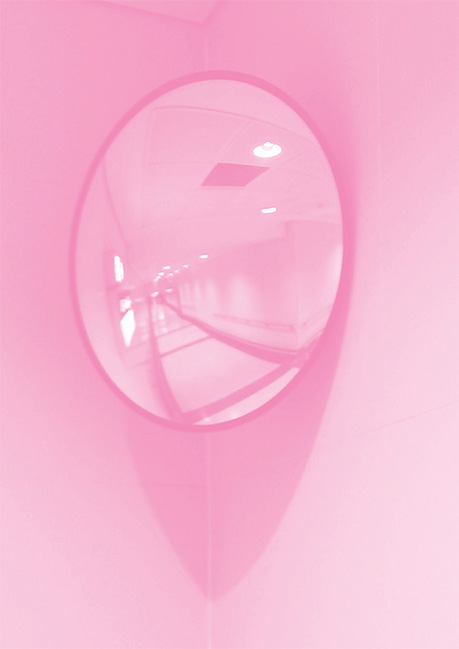 Hazel Watling, Mis-en-scene 2016, Digital Image.
AG - It's necessary to talk about speed, especially the speed of the digital medium. Can, in your opinion, this speed influence the production and success of a work ?
HW - Photo, painting, video ... I'm specifically interested in the process rather than the result. The idea of the instant, coming from Instagram, has changed the way I note down ideas or sketching.The mobile phone as an intimate tool allows a sharing and archiving of daily themes or forms that have attracted my glance or my attention. Those fleeting ideas that are usual lost if not noted down. This increased rapidity in note-taking, is symptomatic of society’s new tempo. The archive is a digital trace of the quick turn over of personal imagery, ideas and interests. I think the choice to use superposition in a work like VISION is a way of dealing with and assimilating this flux of incoming imagery in it's undigested form. Taking a quick photo on your smartphone is not the same as when you take the time to write down or sketch an idea because then you start to digest and synthesis the information. In my work there is always these two elements of speed, a fast execution like when I take notes or apply paint. However, there are many stages in my work which are slow and meditative, taking time to reflect on and deconstruct the image, or choose the right colour, make a selection of work from a larger body, or even to wait for a layer of paint to dry.
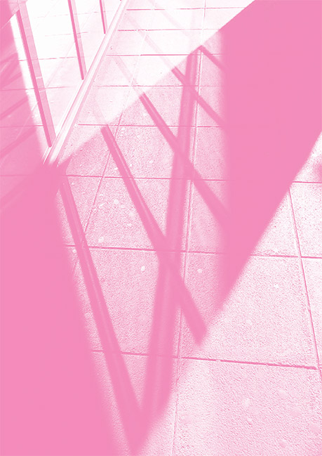 Hazel Watling, Grille 2016, Digital Image.
AG - How do paintings confront with a world where screens are so present?
HW - If I were to make a statistic of how much time I spend living, painting, and on my computer I’m sure I’ll be very surprised by just how much time I spend in front of a screen! What I see and look at always makes its way into my art work, this is because visual impressions and images are fundamental to my artistic research. What I look at on the screen is mainly other people’s
exhibitions, academic texts, youtube videos, films, Wikipedia, and the flux of other people’s personal imagery and of course my own. I see the importance of and optimism in technology, almost all my imagery is being filtered through a screen nowadays, adjusted, re-cropped, drawn on top of, altered in colour etc. However paint has things a screen can’t give, it has a plasticity where
human presence, labor and contact can be felt and made physically present.
AG- Why have you chosen the colour magenta? (As a photoshop filter and a colour)
HW - In the terms of Photoshop - I’m working with software and machines who use magenta as a primary colour. Magenta is its most direct answer to the red – rose spectrum. For me magenta is an overly optimistic colour, it comes at the end/beginning of the colour spectrum, and doesn’t even exist on some of them!
In place of cyan and yellow, magenta is the closest colour to ideas about human love, intimacy, subjectivity and interiority, it is the colour of the eyelid when the eye is closed, when we can see the impressions of the day spent and our own personal world float by.
 Hazel Watling, Courbe 2016, Digital Image.
AG - I have seen lately your work on the saturation of photographic imagery... how do you see this primacy of colour as a subject? Of course you can quote from history and art history, but I believe you have something singular ... (I'm thinking about your quote from Moholy Nagy)
HW - A field of colour is a spiritual and emotional space. I wouldn’t necessarily use the word saturation in terms of colour, in fact my ideal when making some of the works is to avoid saturation and stay ‘soft’. Also, for me the colour isn’t necessarily the subject, I would call it more a vehicle or a state, through which other messages can be received. The concentration of one colour, and
variations of this colour, exercises the eye. In order to see something your eye has to re-adjust, therefore you look in a different way than you are used to.
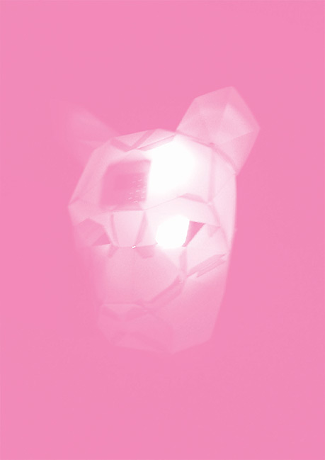 Hazel Watling, Publicity 2016, Digital image.


 Hazel Watling, Mis-en-scene 2016, Digital Image.
 Hazel Watling, Grille 2016, Digital Image.
 Hazel Watling, Courbe 2016, Digital Image.
  Hazel Watling, Publicity 2016, Digital image.